Judge the work you are standing in
A portfolio asks you to believe claims about work you cannot inspect. I have no external client references yet, so a claim is worth nothing here. The only defensible move is to make the reasoning inspectable, including the reasoning behind this page.
So most of what follows is not screenshots. It is the components, running, out of the repositories they ship from.
An order desk that reads like a terminal
A buyer sourcing from South America carries three things at once: the order, the customs paperwork and the money. Existing tools split them across three products, so nothing is ever fully true in one place. And buyers do not work in cards. They work in ledgers.
Design, frontend, backend and the compliance agents are one job here, not four handovers. What follows runs in your browser out of the same files that ship.
The supplier terminal
Where a supplier lands. Everything below runs live in this page. Hover the rail, the order rows, the lanes. It is the product's own render layer, ported wholesale, not a picture of it.

↑ Skin switches every 4s. Hover anywhere to hold it still.
- 01Sorted by risk, not by date. The first thing on screen is not a KPI tile. It is “three things need you tonight”, because that is the only question a buyer opens the tool with.
- 02The only thing that changes between the two skins is one stored preference, which flips a single class on the wrapper. No page knows which skin is on and no component has a light variant. Both resolve through one token contract, so a screen cannot drift out of sync with its own theme.
- 03The light skin is not the dark one inverted. On a near-black ground depth comes from surfaces glowing at different levels; on paper that reads as six competing whites, so structure moves into rule weight instead and the hairlines go hard.
- 04Density over comfort: no cards, no shadows, hairline rules only. Five orders, a vessel in transit, the ledger and the whole regulatory clock fit one screen. Panels are divided by lines instead of gaps, because a gap costs a row.
The rail glyphs, up close
The rail you just hovered runs twenty of these. Each one is drawn on the same grid and animates the verb of its own destination. That is the detail deciding whether a terminal feels built or assembled.
↑ Hover a glyph — the last one stays open.
- 01Every glyph is a monoline SVG on a 24-grid at 1.6px, square caps and miter joins. At rest each one is a complete, legible silhouette, so the animation is never load-bearing for recognition.
- 02Nothing scales as a whole on hover. A glyph that scales says “button”; these are instruments, so the part carrying the meaning moves and the rest holds still.
- 03Colour is not animated at all. It stays
currentColor, so the rail’s own rest → hover → active cascade keeps the palette and a glyph can never contradict its own state. - 04Motion is framer-motion variant propagation: each icon is a
motion.svgcarrying the state, its parts declare only variants. The rail flips one boolean and the whole instrument reacts.
One order, mid-flight
The same chrome, one level in. An order sitting at production with the money already locked. It is the screen a buyer opens to answer one question: whose move is it, and what is my cash doing.
↑ Live render. Hover the rail, the facets, the milestone track, the desk.
- 01Nine milestones, four complete, and only the current one is amber. Everything behind it is a green check, everything ahead is an empty box. Three states, one read: how far along is this, and is it mine.
- 02The desk answers with a name before it offers a control: “waiting on Cottonline do Brasil”. A status chip alone tells you the state; it does not tell you who you are waiting for, which is the thing you actually wanted.
- 03Your money right now is its own panel: held in escrow, released, and the sentence that the goods do not move until you confirm. The order value is set in the display serif while every other number is tabular mono, because it is the one figure on the page a buyer is emotional about.
- 04Raising a dispute is a plain underlined sentence, not a red button, and it states the consequence in the same breath: the escrow freezes until it is resolved. Destructive actions should read like a decision, not a dare.
A shop with nothing rented underneath it
Selling on a hosted platform costs a monthly fee, a cut of every order and a checkout nobody is allowed to change. On this category’s margins the platform was the single biggest line item, so the platform had to go. Catalogue, stock, orders, customer records and checkout run on our own Postgres, with the Colombian payment provider wired in directly and cash on delivery supported, because a large share of the country still pays the courier at the door.
Behind the storefront sits the part nobody sees: lifetime value and reorder rhythm recomputed per customer on every paid order, loyalty tiers priced in the database so the checkout cannot disagree with it, and a three step reorder sequence that stops on its own. That machinery is mine and it stays private. What is worth showing is the front of the shop.
The storefront
Off-white, numbered, nothing shouting. Buying should feel like reading a receipt, not like being sold to, so there is no campaign furniture anywhere in it.
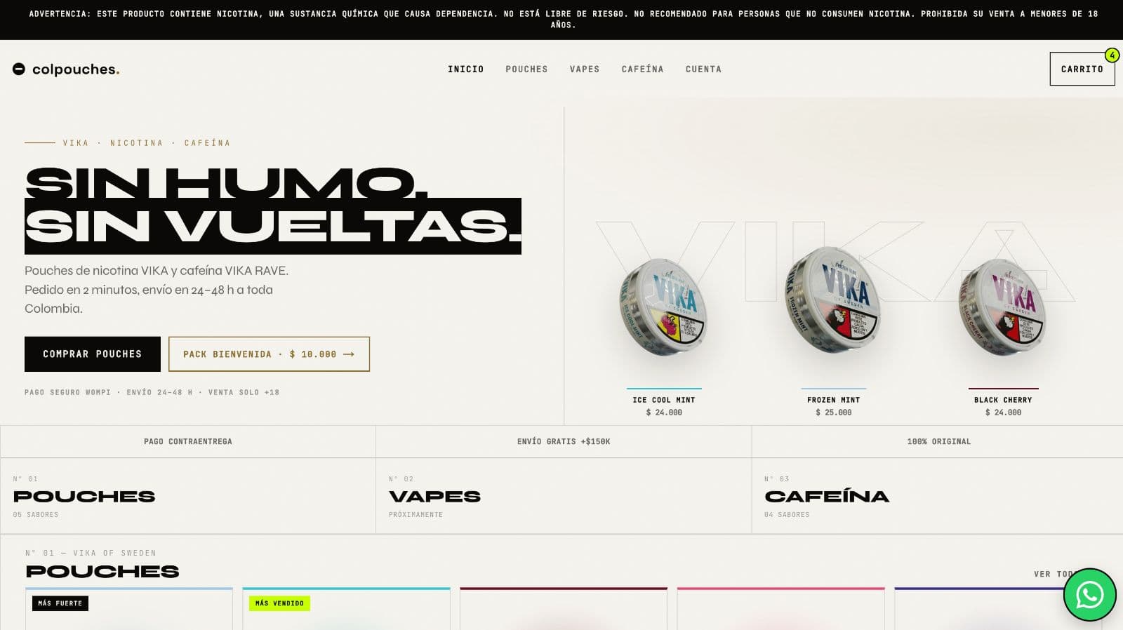
The legal band on top, the catalogue numbered, nothing selling at you.
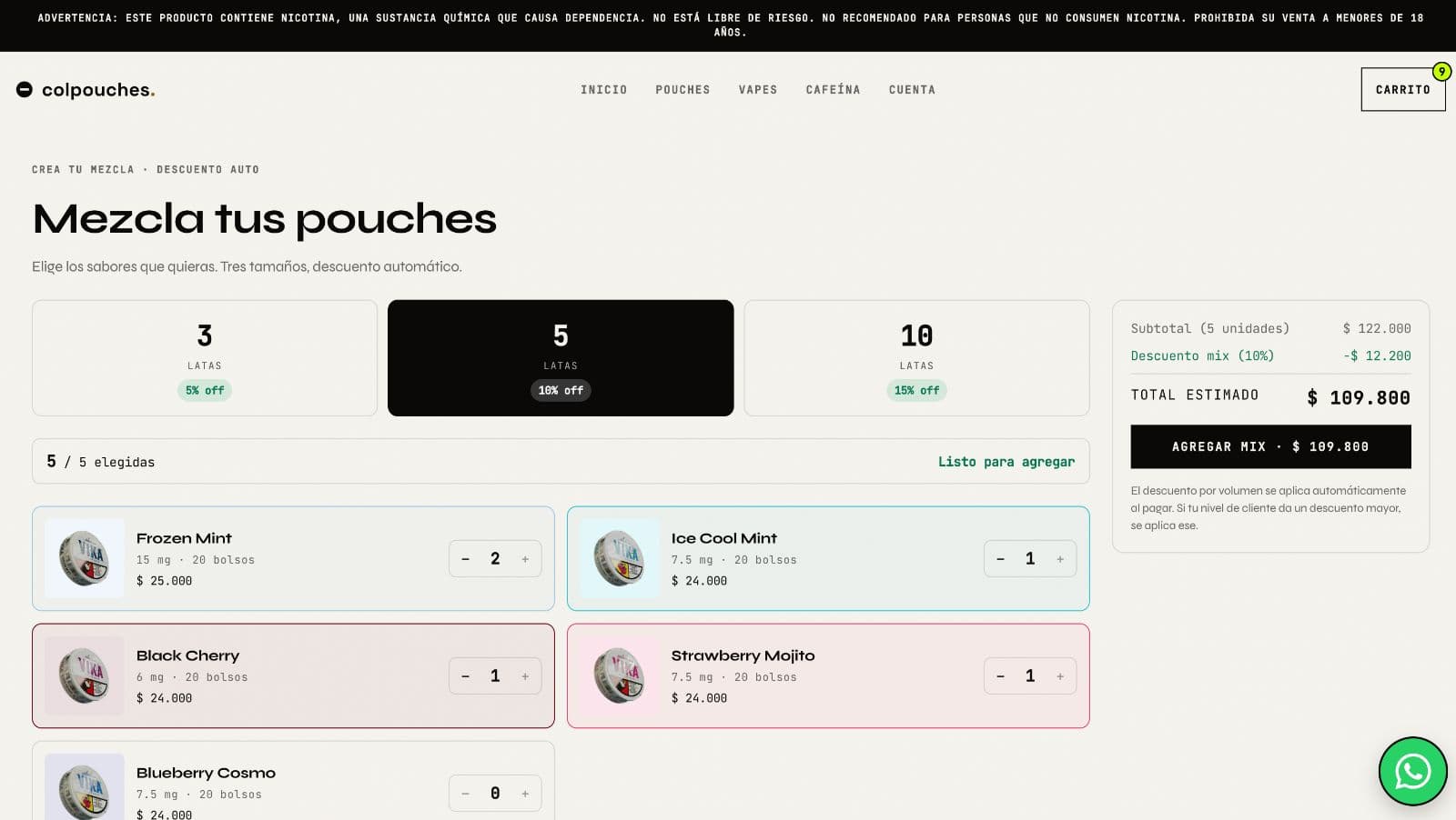
People buy three, five or ten tins at once, so the primary flow is a builder rather than a grid. The 5, 10 and 15 percent steps resolve in place as it fills.
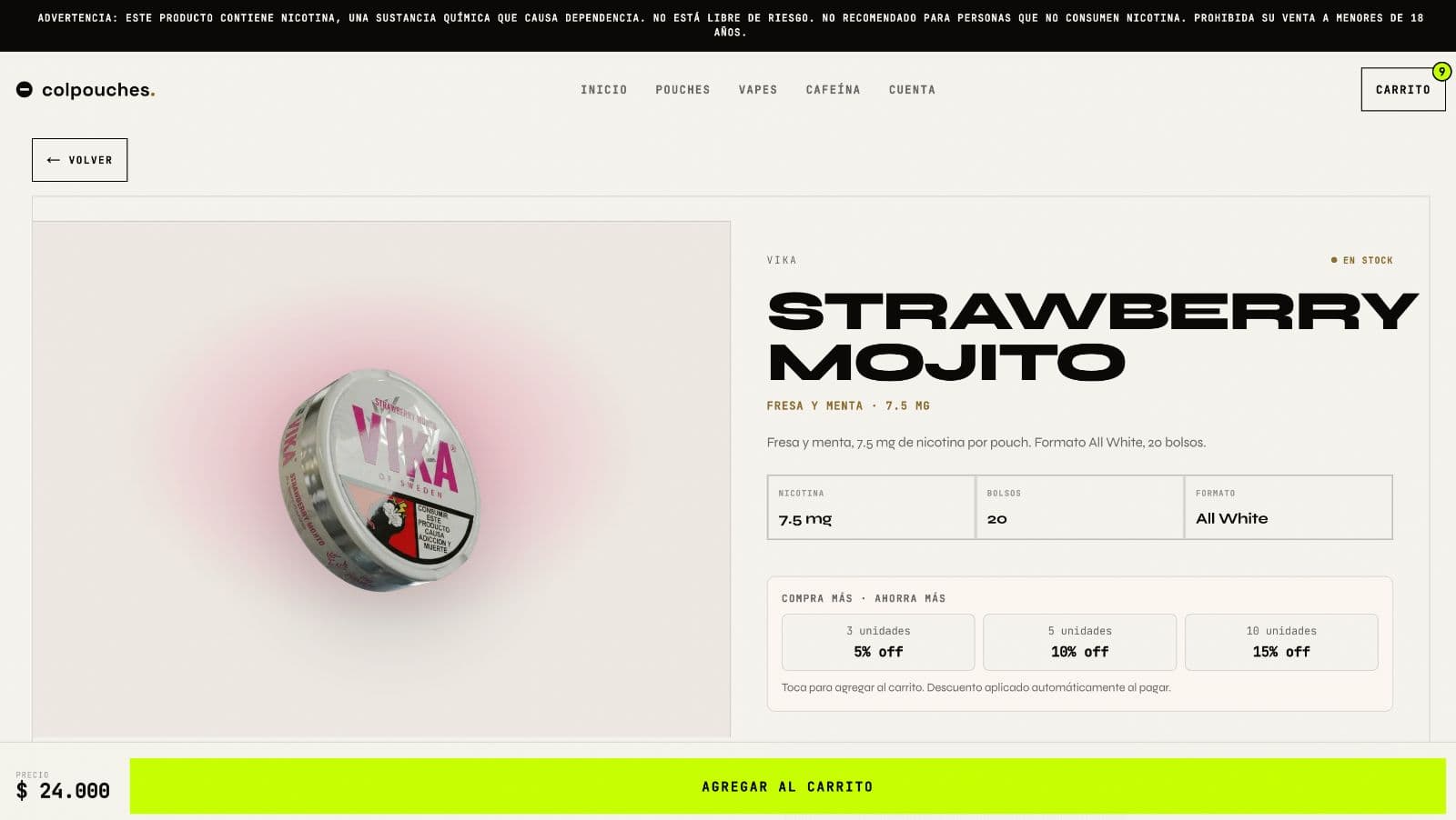
Every discount the customer is entitled to is stated here, so nothing about the price is discovered at checkout. A discount found in the cart reads as a trick.
Regulation as a design element
A nicotine brand in Colombia may not do what lifestyle brands do: no people using the product, no lifestyle promise, a mandatory warning on every page, an age gate before anything. Everything that normally carries a brand launch was off the table.
So the warning became architecture. Instead of being hidden it is the first horizontal rule of the layout, full width, mono, in the brand’s off-white, setting the top margin for every page. The constraint now holds the composition together. That device is reused on this site as the header rail you are scrolling under.
The tin turns as you read
What is left when a brand may not show a person, a moment or a promise: an object, type at full volume, and one gesture. The landing page gives the tin the scroll, so the only thing moving on the screen is the product itself.

↑ Keep scrolling. Clockwise at 0.18° per pixel, the same rate the brand ships.
- 01Three speeds, one input. The tin turns at full rate, the dotted orbit at half, the ring of type backwards at a quarter. Move them together and the whole thing reads as one flat sticker; move them apart and it has depth without a single shadow doing the work.
- 02Scroll drives it rather than a timer. A loop plays whether or not anybody is there and turns the product into wallpaper. Tied to scroll, the object only moves while somebody is actually looking, and it stops where they stop.
- 03The corner readout counts the passage in percent. It is the brand admitting what it is doing to you, which is more interesting than pretending the motion is natural, and it gives the composition a fourth voice at the size of a footnote.
- 04Phones drop the orbits, the halo and the 40px blur and keep the turn. The choice is between a brand that moves and a brand that stutters, and a stuttering luxury object is worse than a still one.
The rest of the brand
Art direction, photography direction, the full Spanish site and a wholesale funnel. Live since March 2026 as VIKA’s official Colombian presence.
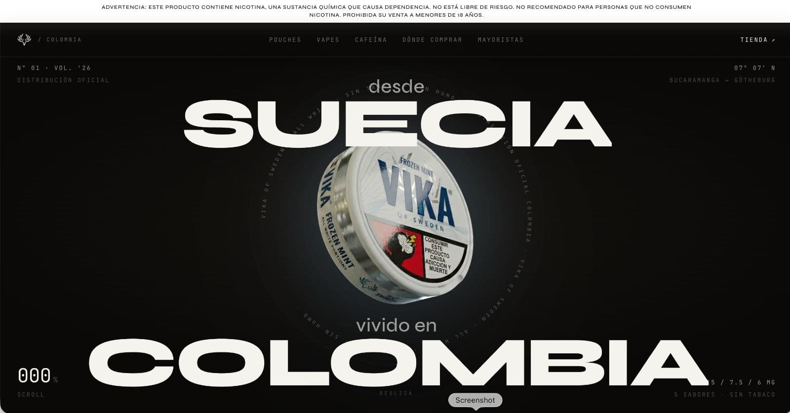
If the product cannot be shown in use, it is shown as an object.
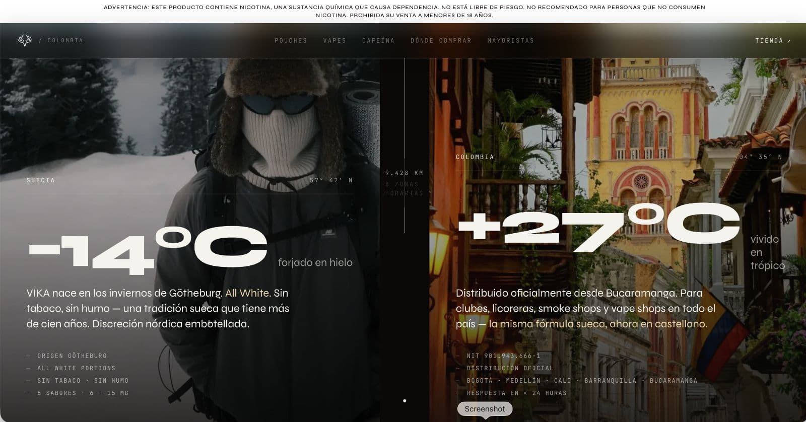
−14 °C against +27 °C. Tiny mono marks give the huge type something to measure against.
Five years of deciding whether a business was worth the money

Three years apprenticeship, then Junior Talent Trainee. Corporate clients and corporate financing. Structured product creation on the trading side: Bloomberg, portfolio rebalancing.
Three to four days at a time in the field, ahead of the forward line, carrying everything needed to stay there.
Process automation. Put AI into apartment listings, which brought photography cost down and every listing up to a professional standard.
Currently on exchange at EAFIT, Medellín. Zürich stays the base.
None of that is design experience and I am not going to dress it up as any. What it is: five years of being paid to read a business model, find where the risk sits, and write it down clearly enough that a committee could sign it.
That is the same operation as designing a B2B interface. Decide what matters, decide in what order, remove the rest. Most of the work in a data-dense screen is not drawing it. It is knowing which number a person opened the tool to find.
The practical version: you do not spend the first call teaching me your business. Incoterms, escrow, EUDR, covenant, KYC, margin, mass balance: use the words. The call is about the decision, not the glossary.
And design and code are one step here, so nothing is handed over, nothing is lost in translation, and nothing gets drawn that cannot be built.
Frontend capacity that does not need managing
For studios with more work than people. I take your design or your design system and ship the frontend under your name, in your repo, through your review process.
Data-dense product screens are the specific thing I am good at: flows, states, empty and error cases, the tenth edge case nobody scoped. If your project is a marketing site with three breakpoints, you have people for that already.
- White label, your name on it, always
- Your repo, your branch protection, your review
- Booked by the day · minimum three days
- Timezone: CET, overlapping most of a US morning
Produkt, Design und Umsetzung aus einer Hand
Für Schweizer KMU und Gründerinnen und Gründer, die kein Team koordinieren wollen: Positionierung, Design, Frontend, Backend und Deployment laufen bei einer Person zusammen.
Fintech, Handel, Logistik, Deeptech. Sie müssen mir Ihr Geschäftsmodell nicht erklären. Wir sprechen über die Entscheidung, nicht über das Glossar.
- Festpreis, vor Projektstart vereinbart, keine Stundenabrechnung
- 50 % bei Auftrag, 50 % bei Go-live
- Verspätete Lieferung: Sie zahlen weniger. Vertraglich festgehalten.
- Deutsch, Englisch oder Spanisch
Tell me what has to ship and by when
Thirty minutes, German or English. Bring the deadline and the constraint; you leave with a fixed price and a date, or an honest no.